
 IT WAS TIME FOR A CHANGE
The original site had not been updated in some time; resources were scarce and management had not seen the web presence as particularly important. But a new manager meant a new way of looking at promoting the Library and its programs.
FIRST WE GAVE IT A PERSONALITY
The logo came first. There was no logo and many different type usages were being used in print and online. We decided to brand the Library as powerfu but to do it in a whimsical way. How better to do that than to channel the superhero concept? The "S" logo was designed to appeal to kids, the main patrons. The logo can stand ![]() alone or with its type usage (both horizontal and in a circle). For the site launch, we created bookmarks and t shirts; both were "sold" for small amounts of money as a way for the patrons to see a real change in look and feel, buy into that change and support it. The launch party was a great success!
alone or with its type usage (both horizontal and in a circle). For the site launch, we created bookmarks and t shirts; both were "sold" for small amounts of money as a way for the patrons to see a real change in look and feel, buy into that change and support it. The launch party was a great success!
NEXT WE INDIVIDUALIZED THE WEB SECTIONS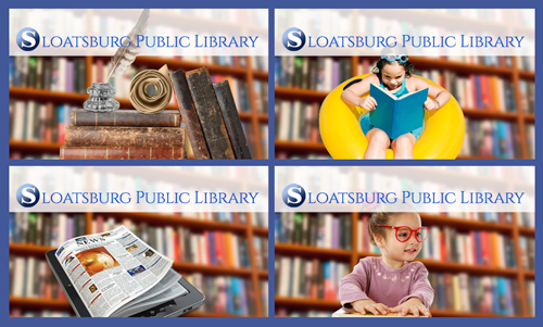
Each section of the site has a different image superimposed on the background bookshelf common throughout the site. Here you see a stack of books and a quill pen for the historic image in the about section, the kid reading in the inner tube for summer reading, the tablet/print image for the news section and the little girl with books and glasses for the kids' section. The Library is always in the background, quite literally, but each section is still unique.
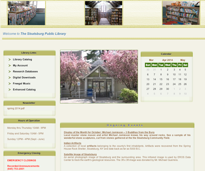
ROTATING IMAGES FOR EVENTS AND PROGRAMS
Instead of using large sliders, we opted for smaller images with timed rotation. When there are no special events, the ongoing programs could be featured. These small images don't intrude but change often, and keep the page fresh and up to date.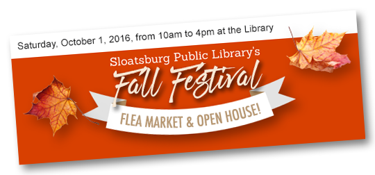
PUSH EMAILS GET THE WORD OUT
But a website just will not do it alone. The LIbrary had a Facebook presence, but not all of the patrons were frequent facebook users. They might not get the information from the website often unless we reached out to them. The Library had been using a paper newsletter mailed and given out at the front desk, but it was time to get all that printed information into a digital format.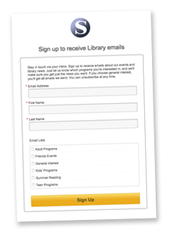
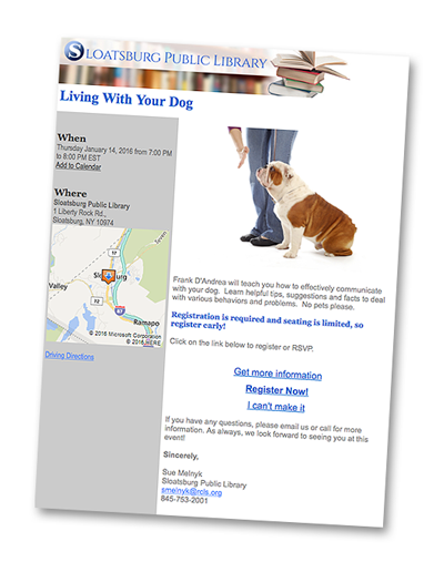 So we started a blast program using the specific section headers and email segmentation to get the message to the right patrons. We then ran these programs as a feed into each web page; patrons can visit the webpage or get the information by signing up for emails of specific interest to them. You can view a visual calendar or click a link in the program feed to get more information, sign up for an event, pay a fee if necessary and get a reminder when the event is coming up. The bottom line? Patrons are happy, and there are more of them. Attendance jumped 38% on average, and the website gets an average of about 1,500 hits a month. This in a community of 3,200.
IT'S PRETTY EFFECTIVE COMMUNICATION
The project is ongoing. As the Library does more for the community, the site will change to support those functions. The future is books, true, but it's much more than that. Recent renovations mean that the facility is more comfortable, better suited to more time spent there. New computer stations, programs that support adult learning, outreach to teens and tweens, comprehensive reading programs for younger kids; all of these and more make the Library a community gem and we are happy to have helped get the word out!
The new site has given us a real presence in the community and the ability to push information to our tech-savvy patrons. We now have the best site in the area in terms of information dissemination and we think that it reflects the Library persona; friendly, fresh and fun! Check it out at www.sloatsburglibrary.org. annmarie mcanany, sloatsburg public library manager